Author Photo - Cheese or Cheesy?

Author Photographs

By now you know how crazy I am about helping Indie Authors produce books that are at least as professional looking as traditionally published neighbors. What that means is making sure every Indie book doesn’t look homemade or amateurish by comparison. I’ve written about getting professional book covers and professionally formatted interiors as well as investing in a knowledgeable editor.

Yet one item continues to drag down Indie books and I’m here to help you ensure your book does not fall into that trap — the Cheesy Author Photograph.

When someone picks up your book, they examine your cover, read your blurb and then check out your author photo when they read who you are. Assuming your cover design is first rate and your book blurb is sharp and concise, what remains for that first impression is the author picture. And there you are in a grainy, cell phone close up, acting goofy. Your book is a mysterious bit of fantasy and you look like a comic. Epic fail.

You’ve destroyed your image and probably your brand unless you write comedy. So let me give you some tips to be sure your author photo is as professional as the rest of your book.
First, be sure you go professional. Ditch the idea that a quick snapshot taken as a selfie or by your best friend’s roommate will do the trick. You invested good money in a cover, an interior, an editor and so you must now do the same for a photographer. A good author photo will last you for a few years and is the professional image that does a couple things:

  • It says you are a professional. You are a business and not a hobby. You want to be taken seriously for your hard work and you have an image/brand that is important.
  • A professional photo highlights your good side, showcases your personality and you let your readers see that part of you which they will look for in the books to come.

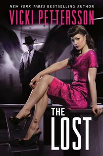
Next, your author photo highlights your genre, albeit subtly. If your genre is romance, then perhaps you want a photo that is soft and wistful. You could take it outdoors and dress in pastels or even fancy dress if you write historical fiction. If you write mystery, you can sit and stare away as if you see something we cannot. Be serious but not too serious. If you write crime drama, maybe your photo will be black and white and you lean against a lamp post or are catching a taxi. You probably aren’t smiling in this one. Fantasy, be fanciful and maybe in the woods or on the lake, or at a tea party. Whatever you choose, make it fit your genre.
Make it fit your age. If you are older, don’t try to look like you’re 18 again. A good black and white photo can highlight (and disguise) a great deal. Ask your photographer what he/she recommends. Whatever you do, make sure you are act and look natural. Readers want to see people in their authors and not more characters.
Stay away from gimmick shots. I know you love the sex aspect – -and yes, sex sells books. But not for your author photo! Unless, of course, you write erotica and porn, then maybe you want your author photo to show you in your nightgown. Or not. Let’s go with not. Anyway, don’t get your picture in the bed or in the bath or hanging upside down in the garage. If you write sports or fitness, by all means go to the gym or get a shot in your sport. But don’t do it just for shock and awe or “because you want to be different.” That kind of different doesn’t look professional and silly is a hard brand to lose once it is applied.
So get a photographer that is experienced in author head shots. HEAD SHOTS. Yes, sure you can have your picture taken in the cemetery on a tombstone if you write urban fantasy about vampires or beasts. Heck it worked for Rob Thurman. But you aren’t her. Sure you can take your photos with your dogs and horses. It worked for Carolyn Haines. She’s best-selling. But again, you aren’t her and maybe you should worry about something more established until you have her success.
Your photographer can tell you what he/she recommends for you. Because of your age or your coloring. I will warn you against dressing in black and white. Unless you plan to shoot in black and white and then check with your photographer. I was told that gray works better.

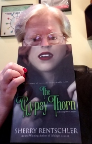
Here’s a good shot and it’s me!

Spend money for a good photograph. And no, it won’t cost you like your cover, formatting, and editor will. I got a great deal for less than $100. And I got 10 various shots in color and black and white. Standard prices run from the low end like mine to around $200. Check references and go look at photos taken in the past. Find a photographer who “gets” you. 

And here’s a fun BAD shot, a selfie of me screwing around
Don’t be afraid to show some personality but remember, saying “cheese” doesn’t mean you have to be cheesy about it. Skip the urge to selfie. Remember, one day this picture could be the shot heard – or seen – around the world. Imagine — the magazine shows a photograph of you, the serious, best-selling, professional author. Think on that and smile for the camera.
***

My new book is scheduled for release on Oct 31. Get ready! Read The Gypsy Thorn while you wait and please leave me a review. I thank you!

Thanks for stopping by,
I remain, Yours Between the Lines,
Sherry

Where are the Professionals?

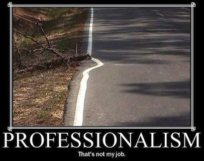
When I was growing up and learning life lessons, my parents and teachers taught some basic rules of behavior that they said would be invaluable to my life and subsequent career(s). These rules, if consistently adhered to, would protect my reputation and mark me as a person of honorable character. Both my parents served in the Air Force and had civil service experience afterwards. They believed in a strong work ethic and impressed that within me. The most important by-line at work was to “be professional.” Here are the important tenants. As yourself, are you one?

1. Your word is your bond. When you say you will do something, you don’t have to promise. If you say it, that IS a promise. If you say it, then you must follow through. That is integrity.

2. If you tell someone you will be at a place at a certain time, then be there. Don’t show up after the time. Don’t assume that not being on time will be acceptable. Be. On. Time. Be early. Ten minutes early is so much better than ten minutes late. When you are late, you are saying that you have no respect for the person who waits. You are saying that your time is more important than the person who waits. They have to give up their time for you, but you are saying you don’t honor them enough to give your best effort and be on time. Again, it shows a lack of integrity.


3. Change is inevitable. Remember that people do not like change and worse, don’t like to be surprised with it. If something is expected of you and you change without telling anyone, people will give you attitude and negativity (in most cases). Be understanding of others and tell others when change is happening. This is respect.

4. There are two kinds of professionals. The first is one who earns money at a job comprised of a majority of amateurs (those not making money). The second is an expert in a particular field. Don’t presume because you earn a dollar that you are more of the second kind of professional than the first. And remember that a true professional, doesn’t need to remind others. Others will naturally gravitate to a professional. This is trust and respect.

5. If you make a mistake, apologize. Do what you can to make it right. Accept that mistakes will happen and be honest and up front about them. Do not lie. Ever. EVER. Once a lie has broken free, others tend to follow. Honesty is a mark of character and shows respect. Lies cheapen your integrity and ruin your reputation.

6. Use manners. A professional knows that behavior matters. Don’t assume things about people. We learned what we needed to know in the first grade: Please. Thank you. Yes/No sir/ma’am (especially to those in positions of authority, elders and customers). How you treat people speaks volumes about you as an individual. You do not have the right to be rude. Not if you are attempting to be professional. You do not have the right to say whatever you feel, however you wish, if those words are vulgar and denigrating. Courtesy is respect. You don’t have to “like” someone to give respect. Civility and respect are twins.

7. Emails do not replace letters unless specified. Even then, bad language and poor grammar show a lack of professionalism. Use your words, not your abbreviations. No one speaks that way in “the real world” (unless you are planning to work on skates or in headphones). Again, show your character, not your ass.

8.  As above, so likewise go phone manners. Remember that half of what is conveyed over the phone is tone. We will accept negative issues more readily if spoken clearly, honestly, and with courtesy. Use words like “yes” instead of “yeah,” and demonstrate an ability to use the words you claim to love. Be professional. Respect for others, patience and positivity, will demonstrate your professionalism and leave a marked impression long remembered after the call is finished. That is perception and true or not, you are the way you are perceived to be. That is reputation.

9. Attitude is everything. If you are surly, disingenuous, apathetic or angry, the negativity will eat into your contact with others. It will brand you as someone with whom dealing is undesirable. You will lose your value, and your reputation will tarnish. Once tarnished, forever tarnished. Practice being positive. Smile. This is strength of character and people naturally gravitate to strength

10.  Most of all, above all, and always, do the right thing. Do the Right Thing. When the moral dilemma bars your way and you are tempted to take the road around, make a shortcut, go cheap, tell that little white lie or turn a blind eye — don’t. Just Do the Right Thing. It’s like stopping at the red light in the middle of the night with no one around. Integrity is doing the right thing especially when no one is watching. That’s strength of character.

These 10 tenants are what it means to be professional. Take them to heart. Make them a part of you. As a writer, attempting to be seen and valued as a professional, you have to BE professional. Whether writing letters, making phone calls, going to conferences, appearing at book signings, and/or performing one-on-one consultations, you must be the professional.

Unlike the termite inspector who shows up an hour late, or the food delivery truck that just doesn’t show up at all, or the person on the phone who is unable to speak for popping gum, or the surly customer service rep who is annoyed that I bothered to call, or the shoe salesman who is aggravated because I want to try on more than one shoe, or the email from the customer service rep who wants to ” <3 my order bcuz she’d B cray not 2,” I want you to truly BE professional. Much depends on it.

Before I finish, I must add one more tenant.

11. A real professional is always learning and improving. No one knows it all. No craft remains static. You continue to learn and to grow or find yourself left behind. A real pro studies and grows within the profession. A real pro is open and receptive to new ideas. A real pro listens and learns. Never be so smart that you forget you don’t know it all. This is wisdom.

Where are all the professionals? It seems that they are missing. Sadly, I find them drifting, or disappearing. It angers me. I’m tired of dealing with unprofessional people. Insist on professionalism. Give it. Command it. Demand it. Live it. Raise the bar. Be the bar. Set a standard. Maintain it. Represent it. Become it. That’s being professional.

Then hopefully, we won’t ever ask, “where are the professionals?”

Thanks for stopping by!

Yours Between the Lines,
Sherry

Let's Get Intimate (with our clothes on)


(Disclaimer: I am not a book cover designer and I have never designed my own covers. This is an opinion/commentary but it is based on research, experience and extensive reading. Hence, I consider it an educated opinion but still my opinion. I urge you to do your own research. Also, I am not providing links to books or authors this time because I am not promoting or excluding any particular author or genre. I support all authors no matter their style. All of these can be researched).

Let’s get intimate with our clothes on. Book covers are a way to be intimate with our readers. We use our covers to entice, seduce, and tease the reader into purchasing our novels. But I have noticed that in the last several years, our book covers have gone way beyond trying to tease and into showing the reader exactly what they’ll receive. And for me, this both disturbing and sorrowful.

Sex has always been a tool, but those who wielded the tool the best were the ones who could draw you to them without giving away their secrets, their privates, their punch lines. Sex sells, always did, but the idea of sex was more compelling than the showing of it.


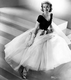
As an example, go back to the legendary 30s and 40s when Hollywood was its most glamourous. Clothes of the period epitomized the “tease, don’t show.” The social values of the times reflected this idea in fashion and in the book covers. Showing an ankle with a strappy shoe, a tight bodice fully covered, wrist gloves that hid delicate hands, stockings with a line down the back that emphasized a promise up high…all concepts that carried forward in movies and books. Sure, times were a bit more prudish when it came to what was allowed in public and on screen; but again, the suggestion of sex, the hint of passion, was enough to set imaginations (and tongues) off and running.

Take a page from the queen of the tease herself, Gypsy Rose Lee, who first gave you a falling dress strap – and nothing else! – and suddenly the IDEA of her naked was more compelling than being naked. That’s why her fan dance – removing clothes behind large ostrich plumes – was so erotic. You never see skin but you believe the skin is naked and you are seduced.
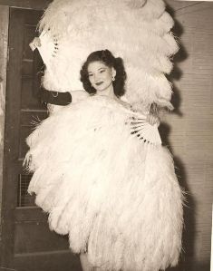

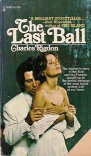
Thus, less is more. But book covers did, and didn’t, follow this idea. While real life was more about how to beautify and tantalize without truly showing anything, as with Marilyn Monroe, it was forgivable to show more if the subject wasn’t real (as with pulp fiction). Here are some examples through time.


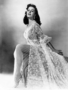
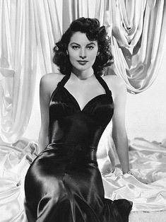
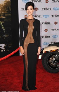
While sultry actress Elaine Stewart teased us in the 1950s through lace and let us peek at a promise of skin, book covers were more intense.

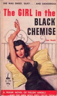
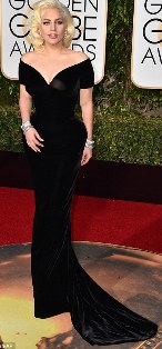
For example, in 1955 while Ava Garner was seducing us with silk and a particular “look,” the popular erotica novel was as equally teasing with more showing than Ava (though we also get “the look”).


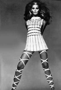
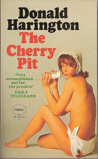
When the free-wheeling, free sex 1960s arrived, tantalizing and teasing took on a new meaning from fashion to erotic book covers (remember what they might not approve of in person, they could draw). Until some underground presses, and more open-minded ones, boldly “went for it” in 1965.


In the 70s, claiming intimacy was more about closer relationships and it showed in book covers, too. More covers with men and women holding and touching, teasing and tantalizing. Even mainstream covers now, openly seduced the reader.

The 1980s brought us the “bosom busters” and readers – particularly women – flocked to read the steamy romances whose covers promised sizzling ultimate sexual fulfillment. I’ve owned a few of these (Rosemary Rogers anyone?) but after a while, the covers all began to look alike. They became more about the sex and less about the story. Not only did the women’s clothes get scantier but the men started losing theirs! It seemed that suggesting and teasing were Gone With The Wind.

In the 1990s a funny thing began to happen to romance and erotica. In the 90s, more books showcased women only covers and in the new millennium, we found a shift in focus heading toward a new, solo showcase of men.

Maybe as we left the 20th century we left behind our sense of good taste. In the newer, fast food society we wanted everything now, immediately, and without preamble. We had to know how movies ended, we wanted reviews of everything so there were no more surprises. We seemed to lose our understanding of the tease and any value of wonderment or the tantalizing joy of seduction. It was like we skipped foreplay. We lost our need for the hint, the tease.

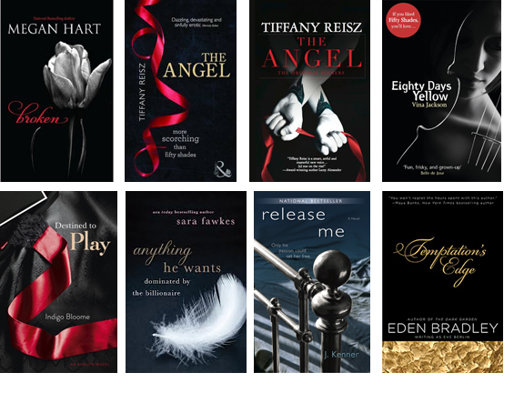
And then, something odd happened. Instead of showing everything on our book covers, we pulled back. Publishers and authors drifted in new directions. Gone were the people. We pulled back on skin in fashion and we gave up on skin for covers. We went to symbols instead. Men’s ties (think Grey, shades of), cufflinks, key chains. Think feathers, swords, and flowers. Think snow globes, glass jars and amulets. And instead of bodies, think half faces, shadowed faces, and women’s backs.

Collage borrowed from ceciliatan.com from fall 2012

Books referenced: Broken, Megan Hart (September 11, 2012, Harlequin MIRA), The Angel, Tiffany Reisz, released September 25, 2012 in the US, October 1 in the UK, Eighty Days Yellow, Vina Jackson (September 25, 2012, Open Road Media), Destined to Play, Indigo Bloome (September 11, 2012, HarperCollins), Temptation’s Edge, Eden Bradley (October 24, 2012, Penguin USA), Anything He Wants: Dominated by the Billionaire, Sara Fawkes (November 27, 2012, St. Martin’s Press), Release Me, J. Kenner, January 1, 2013

That brings us to present day and my real reason for this post (and good for you if you’re still here).

A recent trend has emerged where covers are either one person nearly naked, or two people and the woman is nearly naked. And the posts are about as suggestive as they can be. Little is left to imaginations and hands poke into jeans about to fall from the tops of groins, where bottoms are bared and pearls or whips tickle skin, where women lay in the arms of a bare chested man and their clothes look pulled up but not off, pants jerked down but not off. I don’t want to get into female objectification but hey, there’s that too.

Maybe my imagination is off but there’s little left for my imagination to create. Like that fast food society I mentioned, it seems that book covers again are leaning to baring all and forgetting about the true art of the tease. I’m sorry but there is nothing teasing me when the body is all but bared and clothes are nearly ripped off.

Book Cover, book blurbs, and book videos are meant to entice, to tease, and suggest. When we lose our ability to trust that the reader will get the book and imagine what now is blatantly shoved on the cover seems insulting to me. We’ve lost the “less is more” standard. More is not better. More is just more and often, too much.

There is an old saying, why buy the cow if I can get the milk for free? If a book cover shows me everything about the book then what need have I to get the book? Even if I don’t know the ending, show me too much and I stop being enticed. Tease me. Tantalize me. Suggest and Seduce. Make me want it. Don’t shove it at me.

I realize there are genre expectations. They shift with time, tastes, and expectations. Maybe it is time to believe in the reader again. After all, fashion has taken an upswing and a return to Hollywood glamour. Why can’t book covers turn the tide too?


Let’s return to imagination and suggestion. Let’s be innovative and creative again. Look, even vampires don’t have to go on a black background with dripping blood and graveyards, or biting some hapless sap. See? He seduces and he’s popular!

By Light Betrayed: Poetry of the Vampires by Sherry Rentschler He’s mine.

Let’s get intimate, emotionally, spiritually and then tease me with what else I might get. Let’s do our jobs and provide “the tease” with a promise of something more because we are artists and we can! Use the talent to entice instead of to bare. 


Let’s be intimate and leave our clothes on, at least until we get between the covers!

Go on, surprise me as a reader. And as an author, I will try to do the same for you.

Yours Between the Lines,
Sherry